Brand concepts for a lymph specialist
The client needed to promote his practice and educate people about the lymph system and its role in good health.
Concept 1
• Pull the brand in the direction of “ease” and “healthy + happy”
• Make the educational aspect more accessible
• Appeal to female demographic
• Brighter colors, warm oranges and pastels, evoke feminine energy
Typefaces
Typefaces
• Slab-serif and friendly
• Easy to read at various sizes

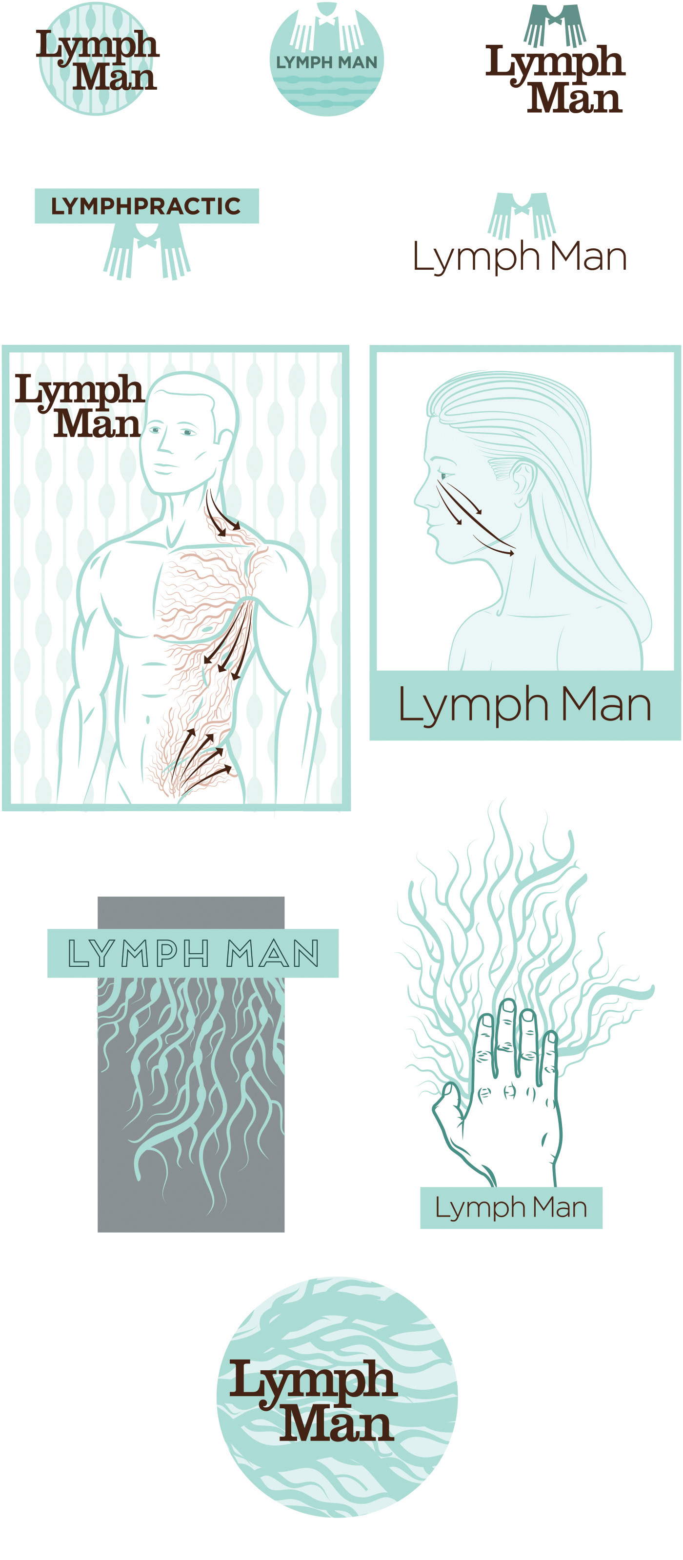
Concept 2
• Pastel greens and medical colors
• Illustrations about lymph draining, nodes, hands pushing vessels
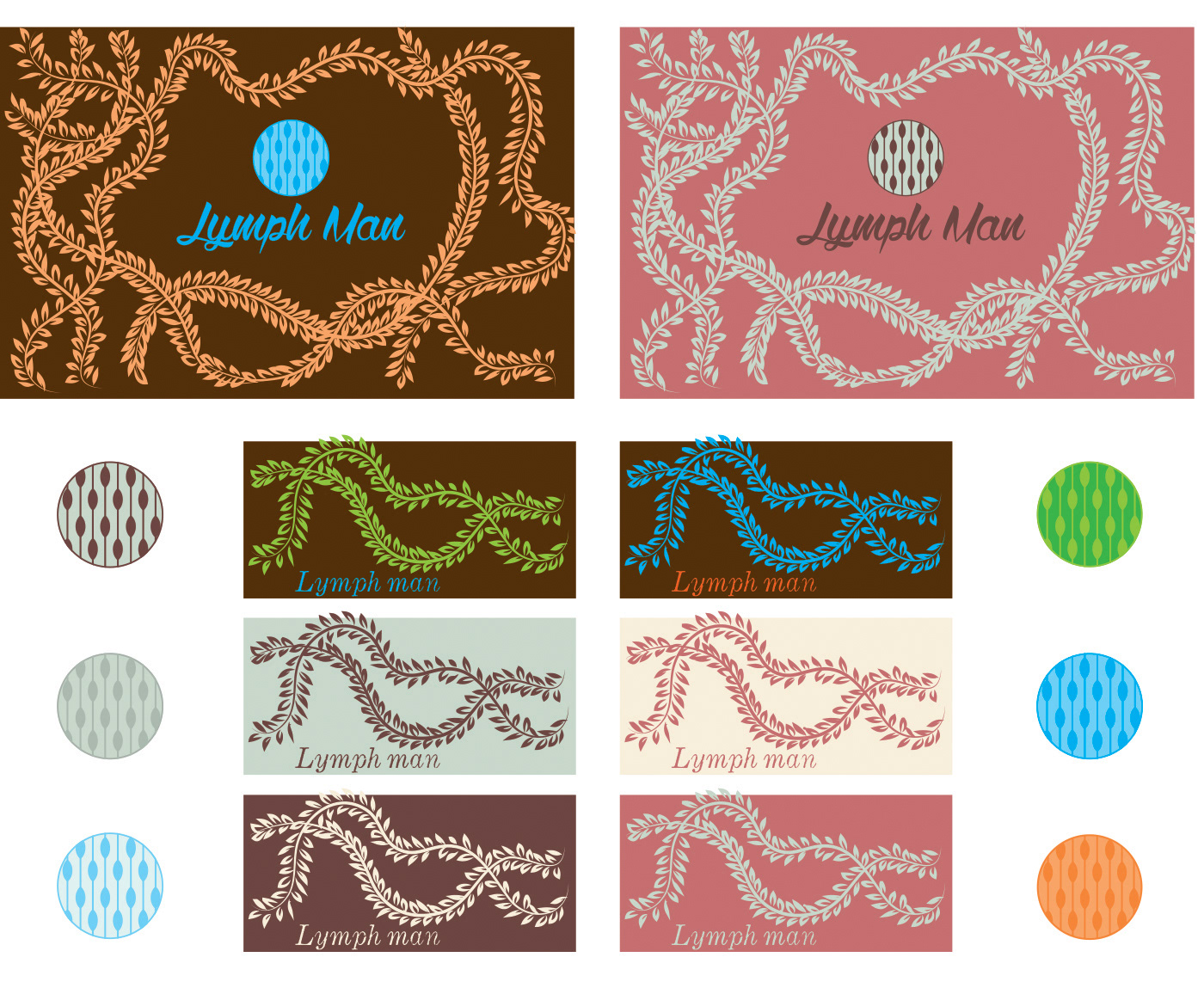
Concept 3
• Growing vines as metaphors for the lymph system
Color
Color
• Warmer palette for Naturopath and Alternative Medicine mood
I also played with illustrating the flowing lymph system by spraying india ink with compressed air